As an event planner logos are an important part of your brand identity. Think of it like this, a key element to gaining customers’ trust is creating, building, and maintaining a unique brand identity, and a huge part of that is your logo.
It’s easy to rely on your name and qualifications for recognition, but as your business grows, you’ll want to create a brand name and persona that will not only stand the test of time but will also strike recognition in the minds of your community and clientele. An important facet of building this brand is creating your business’ event planner logo.
Because your brand’s logo will become the face of your business, it can feel daunting to conceptualize and create your own, but we’ve got you covered. Whether you’re starting from scratch or deciding to revamp an existing logo, consider this your ultimate guide to creating an effective event planner logo!
Why Do You Need an Event Planner Logo?
It’s possible that up until this point, you’ve been running your event planning business under your own personal brand – with your name, a photo of yourself, and a personal email address or phone number as your main contact information.
But as your clientele grows and you become busier, you’ll want to take your business from a personal brand to an official event planning business brand. As you make this transition, you’ll work on building a brand identity – this will be the message of your business that is communicated to your community over and over again to create recognition. The elements that make up your brand identity include your business name, a tagline, color palette, typography, imagery, voice, and – you guessed it – your logo.
By creating a brand identity and putting a “face” to it with your logo, you’re sending a message to your community that you are trustworthy, consistent, and professional.
What Makes a Good Event Planner Logo?
Once created, your logo will often be the first “contact” a potential client has with you, so you want to make sure your logo is sending the right message! Every good logo, regardless of design style, can be boiled down to these important characteristics:
- Simple
- Relevant
- Versatile
- Timeless
- Memorable
When making sure your logo design hits all of these markers, remember to keep your target audience in mind, and tailor each of these characteristics to them.
Ask yourself:
- Who is my ideal customer?
- What will they find relevant when searching for an event planner?
Brainstorm each of these characteristics and you’ll start to build yourself a strong map of your brand identity and the direction your logo should go.
What Kind of Event Planner Logo Should You Choose?
There are a few main styles of logos out there, and understanding the basic styles can help you narrow down what you want your logo to look like.
Image-Based Logos
These logos consist entirely of a single graphic or icon and don’t use words to define the brand. Think Apple, Twitter, or Target. This type of logo works best for well-established businesses that already have a very strong brand identity and no longer need a brand name to spark recognition.
Abstract Logos
An abstract logo is similar to an image-based logo in that it relies heavily on a graphic or icon. However, in an abstract logo, the graphic is not a well-known image, like a bird. Instead, it’s a design that has been created for your brand. These logos often include the brand name beneath the icon. Think, Chase Bank, or Microsoft.
Mascot Logos
These logos include an image of the brand’s mascot, whether it’s a specific avatar or animal. Think the Colonel for KFC, or the monkey for Mailchimp. These work well for larger brands trying to humanize themselves and are less common in small businesses that already offer a more personal approach.
Combination Logos
As the name suggests, combination logos combine the use of words and graphics into the logo design. Examples of this type of logo are brands like Pizza Hut or CVS.
Emblem Logos
Emblem logos are a nod to the use of crests or seals from years ago. These are used in very traditional brands like universities or government establishments but are also most recognizable in the Starbucks logo.
Wordmark Logos
A wordmark logo uses words only in the logo and relies on special typography to call recognition to the logo. This can be typography that already exists or one designed specifically for the brand. For this style, think of brands like Subway, Uber, or Coca-Cola.

Lettermark Logos
These logos are very similar to a wordmark logo, but instead of a full word, a lettermark logo uses single individual letters, like an initial. Think HP, Louis Vuitton, or IBM.

When working on your design, remember the age and recognition your brand currently has. For smaller businesses, wordmark or combination logos work best – use colors, typography, and design to marry your business name to a graphic or style!
How Do You Start the Logo Design Process?
Let’s break it down! Here’s a step by step process to getting started on designing your new, event planning logo:
- Define your brand. Make sure you take your notes from the above questions to help you build out your brand identity. Especially focus on the feelings you want to evoke, and who you decided your ideal customer was.
- Take a look at your competition. What elements have they included in their logos? What aspects do you like? What aspects would you do differently? Having a finger on the pulse of the local market will help you stand out from the competition in all the right ways, while also giving you a good idea of what’s currently working in your market.
- Look for inspiration. Research logos and see what speaks to you! What do certain colors make you feel? What brands do you admire, and what are they doing with their logo? Combine your notes with what you found from your competitors, and you should be able to start to build some visuals in your mind.
- Decide on your design style. Whether you prefer modern, traditional, glam, or something else, your design style should reflect that! This will show on your site, on your deliverables, and, of course, in the design of your logo!
- Understand your brand colors and typography. Are you known for using a certain color in your advertising or on your website? Do you gravitate toward a specific font when typing something up? Use your logo to concretely define the colors and fonts you want to represent your brand…and stick to them!
- Decide whether you want to outsource your logo or build it yourself. Hiring a designer will require a great deal of communication to ensure your vision accurately comes to life. Platforms such as Fiverr are great for finding freelancers at a low cost. You can also try your own hand at logo design with a program like Canva, Adobe Illustrator, or Inkscape. Whether you choose to hire a designer or use a program to design your logo yourself, don’t skimp! This logo will be the face of your brand for some time to come.
Things to Avoid When Designing Your Event Planner Logo
Now that we’ve covered the best practices for logo design and how to get started, here are a few things you should not do:
- Overcomplicate. Simplicity is key! Avoid using too many graphics, colors, or a font that’s too busy to read. The simpler your logo design, the easier it will be to remember and recognize.
- Use generic stereotypes. Don’t pigeonhole your brand! If your event planning business focuses on weddings, you do not need to use an engagement ring or wedding bells in your design. Again, keep it simple!
- Don’t skimp on cost or details. As we mentioned before, don’t hire the cheapest designer, or avoid a design program you like because it costs money to use. Using budget resources will result in a budget design that won’t reflect your business. If done correctly, this is a business investment that will stand the test of time!
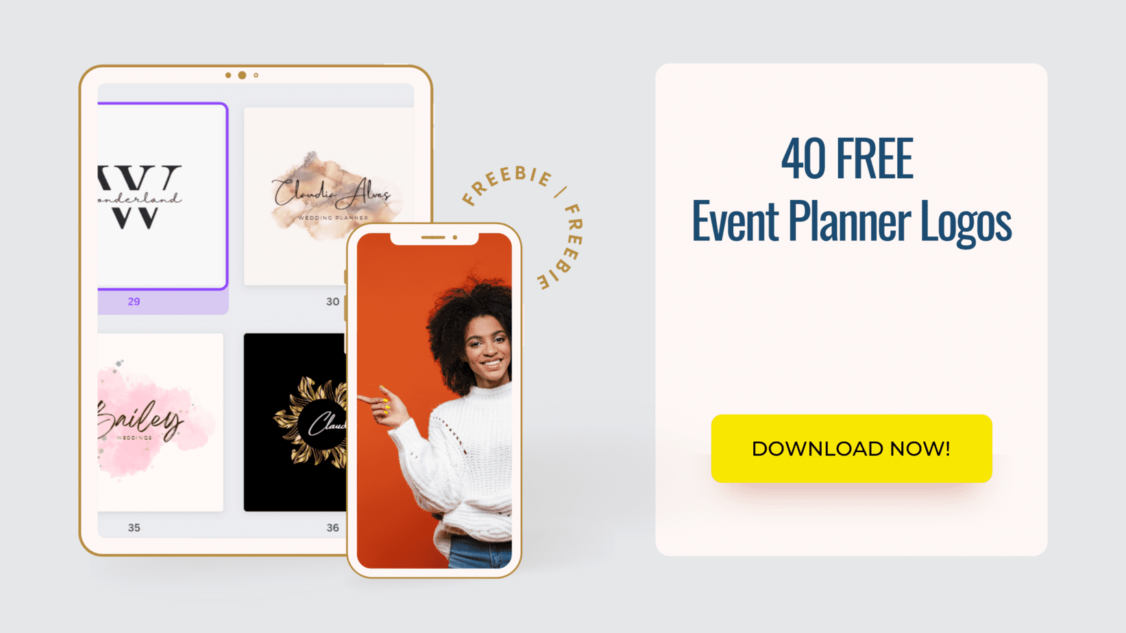
Ready to get started and hit the ground running? We’ve created a file of 40 beautiful event planner logos for you to peruse and try. Before you know it, you’ll have a well-established event planning brand with a stunning logo.
