Having a pretty event planning website is great, but is your website designed to book more clients? How customers view your business and how quickly they are able to locate more information about your services is crucial for securing more clients. If your website is not converting visitors into customers here are 5 key things you need to review and update today.
1. Website Homepage
The key to a good website begins with the homepage. This is the first place customers land when they visit your website. This is also your opportunity to make a great first impression. What a customer sees when they visit your homepage, could mean the difference between them leaving or continuing to navigate your site. A few things to keep in mind when designing your homepage is to ensure that the information presented is clear, concise, visual and value packed. Customers should immediately be able to tell the type of business this is and the service you provide. To achieve this the following items should be included on your homepage:
- An image that gives a quick glimpse into the type of events you plan
- An overview of your business and services
- How to navigate the website for more information (eg. a menu bar)
These three items are important to have on your homepage to entice customers to linger and learn more.
2. Gallery / Portfolio
Having a gallery of past events you’ve planned is very important for event planners. You will need to share with customers a sample of your work and this page does just that. Consider this page your online portfolio. This is your opportunity to show off your skills and expertise. Why not wow them with snapshots of your past customer events? Explaining to a customer what you can accomplish is great, but being able to show them with a photo is even better.
A picture is worth a thousand words.
3. Pricing / Packages
One page that cannot be forgotten is one that outlines the services you offer and the cost. Your website should provide customers with as much information as possible to help answer their most common questions. Potential event planning customers are usually curious to know the type of services you provide and the cost. Your packages and services page should clearly outline this information. Customers should leave knowing exactly what it is that you do and the different ways in which you do it.
It is also recommended that you have a “starting from” price listed on your packages. This will provide your customers with an idea of your pricing, without confirming a final price. It will also help them to be better informed about if your services are within their budget. On this page ensure that it is also clear that this is not your final price and encourage customers to contact you for services not covered in the noted packages.
4. Contact Page
Your contact page is one of the most important pages on your website because this is how customers will connect with you if they have questions. It is therefore important to ensure that you make it easy for them to do so. Unless you are a large event planning company, try to not use a contact form on this page as it can seem impersonal. If you do use a contact form, also include your email and phone number on this page for customers who would like to opt out of using the form.
Making it easier for customers to connect with you will increase your chance of getting more customers. And who doesn’t want to book more event planning customers?
5. About Page
This is one that a lot of event planners struggle with and as a result, it usually reads like a corporate bio. If your About page reads like that of a giant corporation it is time to give it a quick refresher. Customers who have never worked with you before will visit your About page to learn more about the company, however, they also want to learn more about you. Who is the owner? Who plans the events? What is your passion? Why is your company different? and most importantly, why should they hire you?
I suggest making this page read like you’re telling a story about something you enjoy doing, to a friend. Make it professional but also personal. At the end of the day, customers want to feel like they will be taken care of and that their needs are important to you. Do you feel that way when you read the about page of a large corporation? chances are you don’t. So why not give your customer the experience you would like to have?
Update these 5 pages on your website and I guarantee that you will see more conversion from your website traffic.
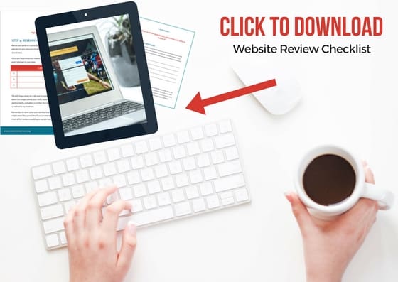
If you’re struggling to write content for your website or are just looking for a website review, please don’t hesitate to contact me.


